The Color of the Milky Way… Some tips on best practice processing!
Wildlife and landscape photographers share one common goal: to show the beauty of nature as naturally and undistracted as possible. The Night Sky and celestial objects within – like the Milky Way – are considered an important part of nature, too. Careful editing of Night sky images is thus recommended if you want yourself to be considered a good astronomic landscape photographer instead of an artist. Here are a few hints on best practice for processing Milky Way shots.

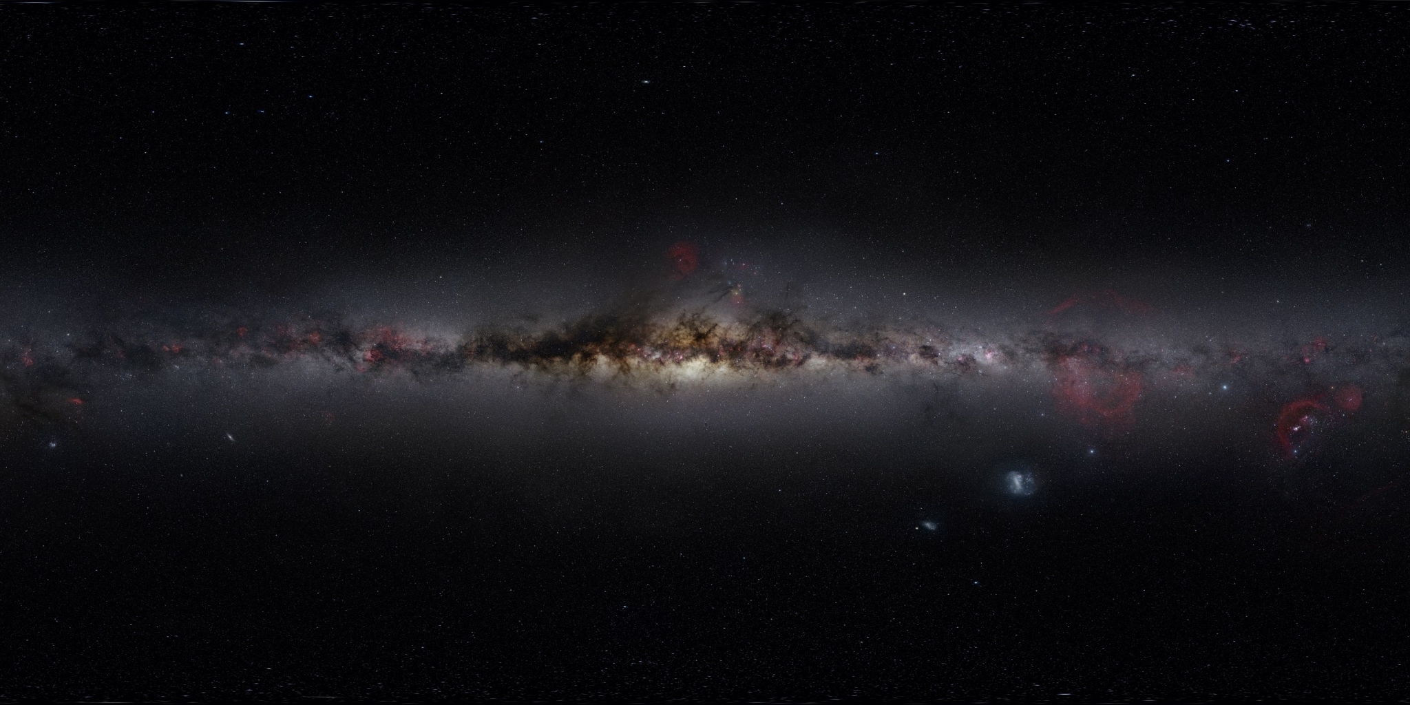
Milky Way above La Palma, Canary Islands. Careful processing retained most of the RAW information.
It is widely agreed, that changing the natural colors of a sunset or landscape is considered some level of altering reality in wildlife / landscape photography. Not only the best photographers usually invest a considerable amount of time and workmanship for correctly color balancing their images, to preserve highlights, shadows, details as well as not to overdo contrast, saturation etc. You can do the same.
Everyone knows for example the fresh green color of a spring meadow from every-day experience, and actually most of us don’t want to have that altered unrealistic in nature photography. No nature photographer as well as most readers would like to see an image published in National Geographic or GEO, where the print does not represent the natural colors by the time the image was captured. Furthermore to make sure nature colors are preserved best, camera manufacturers push hard on their latest image processing engines, which preserve the last extra bit of original information in every RAW file for post processing, and good photographers take advantage of that information. There’s a lot of craftsmanship too at the stage of printing, to preserve the image colors as they were processed by the photographer.

Milky Way above the Photographer at La Palma, Canary Islands.
If we now consider the Milky Way and the starry Sky as much a part of the natural world as flowers and grass, distorting its colors is – not only amongst Astrophotographers – viewed as unethical, unless it’s done with a declared aim of artistic expression, or for some other valid reason.
The night sky is a part of our surrounding nature, and it should be treated with the same care nature photographers do regarding natural colors in landscape astrophotography.
“Because, if you publish a photo of a blue sunset in landscape photography, it’s immediately clear that either there is something badly wrong with the camera/processing or you were the first human on Mars to see this view!“, says TWAN Director Babak Tafreshi, as described on the Sky&Telescope article, Capturing the Beauty of the Night Sky (read under “Natural Looking Sky Images”).

Milky Way above the Cerro Paranal Platform, Paranal Observatory, Chile. TWAN founder Babak Tafreshi is enjoying this magnificient, unspoiled view.
Tafreshi, a Lennart Nilson Priceholder*** for scientific photography, and founder of “The World at Night“ – a global IYA 2009 UNESCO program to make people aware of the beauty of the Night Sky – has processed thousands of starry sky images since he started Astrophotography over 20 years ago. Careful image preserving processing is also an important part at his Lectures during the Astromaster astrophotography workshops.
Tafreshi is indeed a bit worried about the flood of false-color, over-saturated, over-contrasted images of the Nightsky that pop the web these days. In fact, natural looking sky images even seem in defense in the age of facebook and social media. False colored or overcooked Images are getting more and more common on image sites like 500px and social networks.
But why are they so badly processed (except again, for maybe artistic reasons)?
It seems many photographers new to Astrophotography have not yet discovered, how Astronomers have researched and agreed with great care for many years, how the Milky Way should be reproduced in an image. A good starting point are the many outstanding images on the ESO site of the European South Observatory.
Second, many beginners in landscape astrophotography simply overcook processing with ramped up contrasts, weird color temperatures, over saturating their images (I did that too, in my early days).
Add to this the ever increasing problem of light pollution in many countries on earth (light polluted images are difficult to color correct), and you realize that most people have lost the sight of a natural looking night sky.
So, why then should they actually find images like these below wrong at all? They just don’t know it, but again, what about green grass that is now blue or red?
A good practice on processing, and some simple facts taken into consideration (see below), and things can improve a lot on a landscape astrophotography.
The worlds best Wildlife and Nature Landscape images not only capture the moment – they are all excellently processed. We as astrophotographers owe some patience and dedication to nature when we work on our images, especially on images of rare starry skies.
The ancient light of the stars has travelled millions of light years until it finally hits our retina as well as our camera sensors. Why throw stars away by over saturating and over contrasting images…

The over contrasted Image right shows less stars than the left image. Overcontrasting “eats” stars.
If you have a clear sky and photograph the Milky Way, how should the processing results look like? The following guideline and examples are provided by my colleague Babak Tafreshi:
1- The Milky Way is pale yellow (the colors change slightly along the plane)
Outstanding examples by Prof. David Malin*, inventor of film color astrophotography, from his Akira Fuji Collection (these are scanned film images, and the originals are impressive to look at):
http://www.davidmalin.com/fujii/source/af2-02_72.html
http://www.davidmalin.com/fujii/source/af2-03_72.html
An amazing story by itself about being closest to the stars, but also a beautiful, careful color processing of the Milky Way by TWAN member and ESO/Paranal Telescope Engineer Stephane Guisard:
http://www.twanight.org/newTWAN/photos.asp?ID=3002596
A Milky Way image directly from the Alps (20 km from Innsbruck) – with a lot of light pollution low on the horizon from Northern Italy – so this image was not easy to process at all…
http://www.twanight.org/newTWAN/photos.asp?ID=3003231
2- Notable stars should have colors that match their individual temperature range (if not white saturated by the sensor). If you capture red giant superstar Antares or Mars in blue, there is either a wrong calibration or something dramatic has happened to the star!
3- Sky background color (natural skyglow) in a dark site is (not accounting aurora and light pollution)
A) black pale green-red depending on airglow activity
http://www.eso.org/~sguisard/Pagim/darkest_sky.html (amazing example by Stephane Guisard)
http://twanight.org?ID=3003578 (stronger airglow appearance)
B) Blue when there is moonlight or twilight
Of course Astrophotographers often change color temperatures in processing to reduce the yellow-red cast of light pollution in the skyglow. There are also SkyGlow filters to avoid having to do so. But the Sky and Star colors should not go too much into the blue then.
4- Zodiacal light is white-pale blue

Milky Way and Zodiacal Light above Cerro Paranal, Chile.
So, actually what is the bottom line? Well, don’t overdo it. Be careful on saturation, vibrance and contrast.
Especially as many processing hosts on the market today like Lightroom 4, are very agressive on saturation, contrast and vibrance – it seems they are actually optimized for daytime photography and need to be very carefully used on the processing of starry sky images. Too much saturation / contrast** can “eat stars”, too, the fainter stars disappear in your image easily.

Milky Way above La Palma, Canary Islands.
Then another reason may be drastically non-color balanced screens, those false colored images may have been worked on. If you really consider to do much landscape astrophotography or nature photography in general: a calibrated screen helps a lot, and there are quite some good affordable color meters on the market. (tip: if you want to track the stars, to have them pinpoint on your images during longer exposures, a star tracker can be a great tool to improve your images).
Finally: While I do not consider myself the best astrophotographer, I always try to get my version of the Milky Way the best possible processing. Which is not always easy under a light polluted night sky.
At the end of the day, however, one thing is clear: the Milky Way isn’t green or red or totally magenta – nor is the night sky (except for Light Pollution – which – with Sodium Lamps below will add a orange cast to clouds etc).
So let’s keep trying to preserve the glowing beauty above us the best we can in our images – to give people and kids who are living in light polluted areas a natural view of one of the wonders of our world.
And if you want to see some Milky Way now – enjoy Astronomer’s Paradise. It’s dark, cold, but beautiful – Atacama Skies! “AP” as we also call it, is a huge international success and collaboration with my pal Babak Tafreshi of Twanight.org!
Astronomer’s Paradise from Christoph Malin on Vimeo.
Sincerely
Christoph Malin
*I am not a relative to Prof. David Malin – Lennart Nilsson Priceholder and honorable inventor of film color astrophotography.
**for Timelapse short films I do increase contrast amongst other settings slightly a bit to have a more cinematic look, but for stills I try to avoid it.
***A bit comparable like the nobel price for photographers
source:http://christophmalin.com/2013/01/the-color-of-the-milky-way/