Getting the colors right in your astrophotos
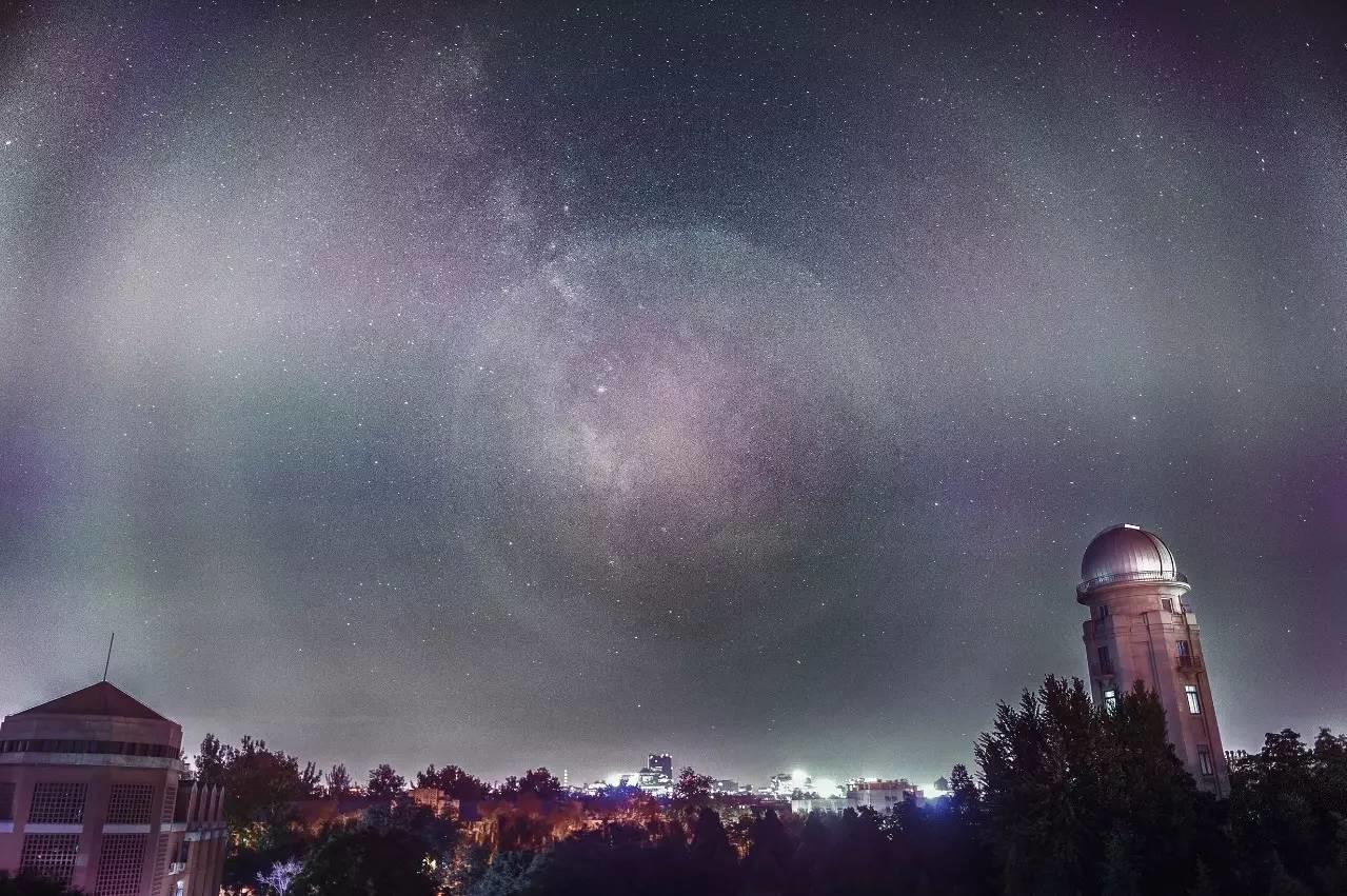
The right colors in your images
What does it actually mean to have the right colors in an image? What does ‘proper color calibration’ mean?
These might seem silly questions at first. Surely there is objectivity in colors right? Grass is green, the sky is blue and all that. Well, yeah maybe. There are of course pure colors of well defined wavelengths which we gave particular names. But the problem is, in the real world we don’t see single wavelengths of light and our perception of them is also influenced by context and other colors. ‘Seeing a color’ means human perception, which is a matter of both our eyes and our brains. And we all know how faulty our brains are and how easy it is to fool them as we can see in the example below;
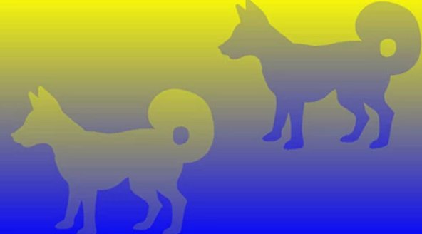
You can clearly see two dogs in different colors right? Except they aren’t. They are actually the same color.
And there are many examples like this. Just do a quick Google search on ‘optical color illusion’ and see and examine the great examples that will be presented to you.
Color Constancy
A particular interesting phenomenon is color constancy, a color perception mechanism that basically will ensure we perceive constant colors of objects under different lighting conditions. Evolutionary this helped us with recognising things so this was a clear advantage. This adaption is certainly not small, as we can see in the following example;
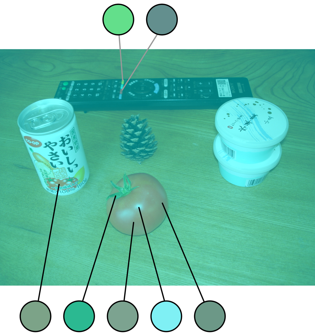
Source: Akiyoshi Kitaoka (I highly recommend checking out this site for a huge number of optical color illusions)
You might realise at this point that this example is actually extra interesting since it is different from most optical illusions where we are ‘tricked’ to see different colors while there aren’t any and we are fooled and what we perceive is clearly wrong. The color constancy example on the other hand, helped us actually perceive the correct color of the object even though the color in the picture was ‘wrong’. So there is objectivity in terms of color, but that doesn’t help us at all to determine the ‘correct color’ as our brains adapt and will perceive a particular color anyway even though it is clearly wrong; we see clearly a red tomato in the picture while it is not red at all.
Objectivity; scientifically accurate colors and anthropocentrism
What does this mean for our astro images? I’d say we have now seen we can speak of ‘correct colors of objects’ apart from their actual color in an image (ie. the red tomato). In terms of colors, there are things we know to be true. For astronomy this means we know that an emission nebula is red, a reflection nebula (in general) is blue, certain known stars are orange while others are blue. We can say these are the colors as we are used to be seeing them. In terms of deep sky photography and space in general, one might argue that a human centered definition of a correct color doesn’t make much sense and I can agree with that. However, we are talking about images here that will be looked at by other humans, so some form anthropocentric approach to colors is applicable to our photos in my opinion.
Maybe the most important thing here is that we can objectively explain why certain elements in our pictures have certain colors.
10 million different colors
The previous part about scientifically accurate colors sounded easy enough right? h-alpha is red in astrophotography (in a RGB palet), but just ‘how red?’, which specific red color?
We humans can perceive up to 10 million different colors so it is far to simplistic to just talk in terms of redand blue in our images. Furthermore, almost never will we be capturing ‘pure light’ from one particular wavelength from one source. Light will have traveled through other stuff before it hits our sensors, it will have mixed with other light of different wavelengths, etc. In the end when we are processing our images, we are no longer dealing with just a few color variation, but with possibly the whole range of colors we can perceive as humans. It is highly nuanced and complex!
Subjectivity; “but does it look good?”
It may seem tricky to throw in more subjectivity, but I feel we can not avoid admitting that, in the end, this might be the most important requirement for our (personal) approach to color calibration. What we will find ‘visually appealing’ is for a big part influenced by the already mentioned factors; we have our ‘objective’ notions what is a correct color, there is a scientific notion of a correct color and we have our expectations based on past seen references. All this is important for something to be ‘visually appealing’, but of course the inevitable personal taste plays a role here too and we should not ignore it. And I would say this is good thing; it allows us to add a personal touch to our photography and keeps us creative, even though we are of course more talking about hues here rather than different colors.
Definition of correct colors and color calibration
In order to be able to discuss colors in astro images we will have to give a definition of correct color calibration. My view on such a definition is that it should accept that color perception is contextual and subjective.
That said, I think correct color calibration in astro images;
- is consistent (within a specific collection)
- is scientifically accurate and reflect ‘what we know to be true’ (note that his also can be ‘false color’ like the Hubble palet for instance)
- delivers a neutral background (where applicable)
- offers room for creative freedom and personal touch or style
Correct colors in astrophotography
Discussing the objective part of correct colors in astrophotography may seem surprisingly easy, since there are only a very limited set of objects (or phenomena) for which we have a shared definition and expectation of a specific correct color. The well known Hubble Palet even limits itself to assigning different colors for just three different elements!
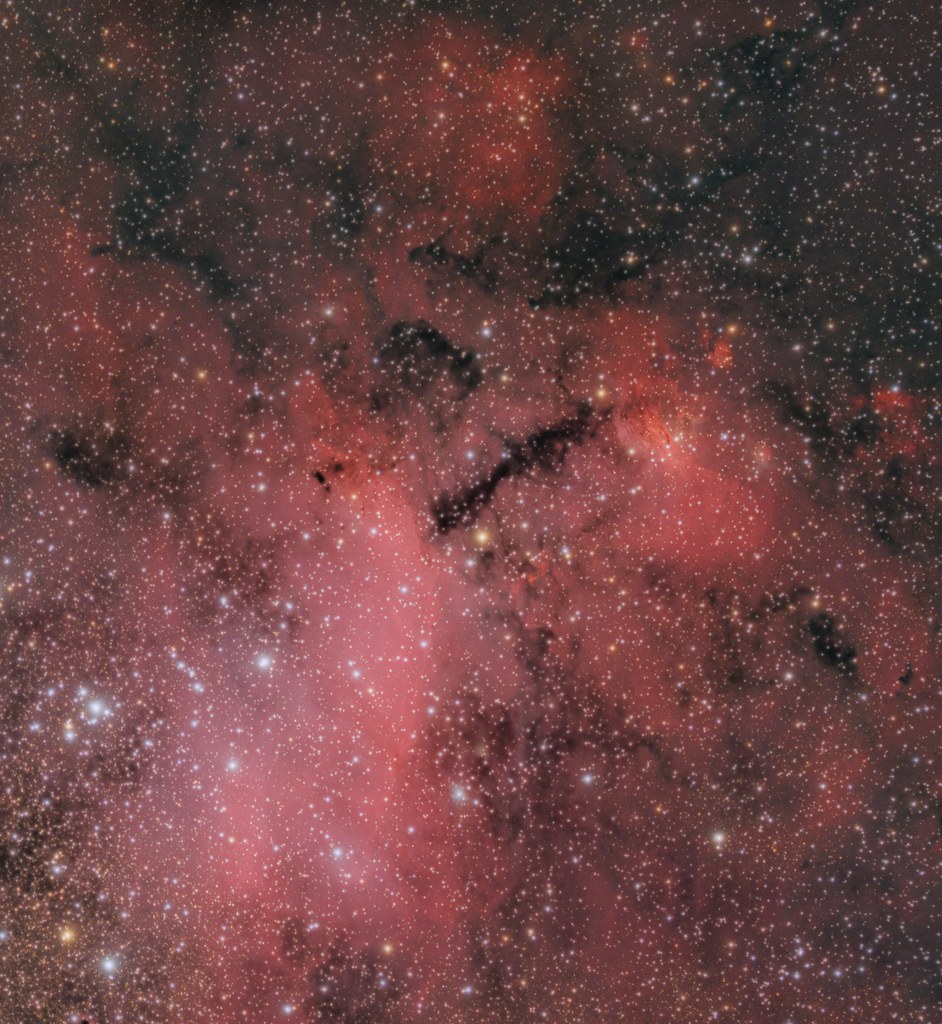
On the other hand however, we have seen that it is to simplistic to just talk about ‘red’ and ‘blue’ representing specific phenomena in astro images. I would say however that the common shared definition of ‘correct colors for specific astronomy objects and phenomena’ is a very good starting point for correct colors in astro images. If your emission nebula doesn’t end up looking red, you’ll probably have ‘wrong colors’ in the picture; h-alpha has a wavelength of 656 nm and lies at the far end in the red part of the visual spectrum. However we all know that even within the same object you will find different colors of red, as we can see in the picture of the Prawn nebula below.
Again, this is mostly because the light emitted by the emission nebula will be influenced by and mixed with other light sources emitting or reflecting different wavelengths. This is just as important to realise and keep in mind as knowing h-alpha should be red.
Take for instance the Lagoon nebula. In the majority of pictures this will be represented with a dark red color. This is correct right? The Lagoon nebula is an emission nebula, so surely it should look dark red? Well no, not necessarily. I’d even go as far and stat that this is could be considered to be wrong color calibration. The Lagoon nebula should look pink! This is especially interesting since pink is not a ‘spectral color’ in the sense that it isn’t a certain wavelength. Instead it is a mixture of wavelengths.
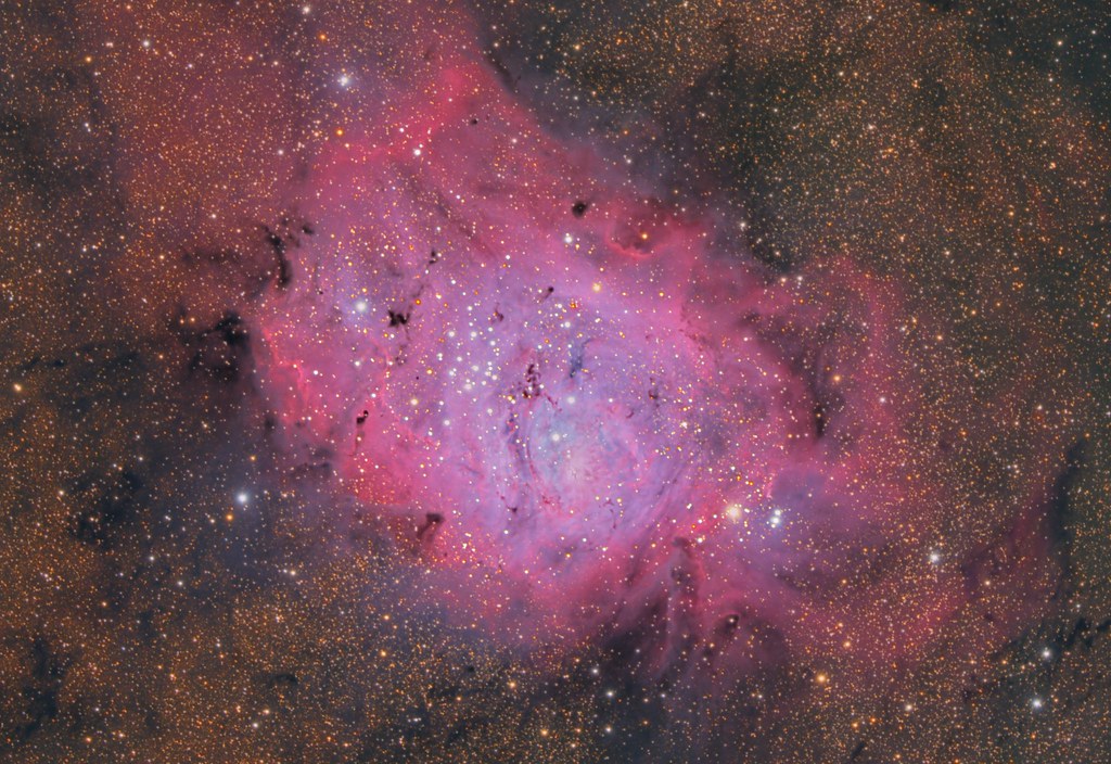
Now let’s look at the Cat’s Paw nebula, which really is dark red.
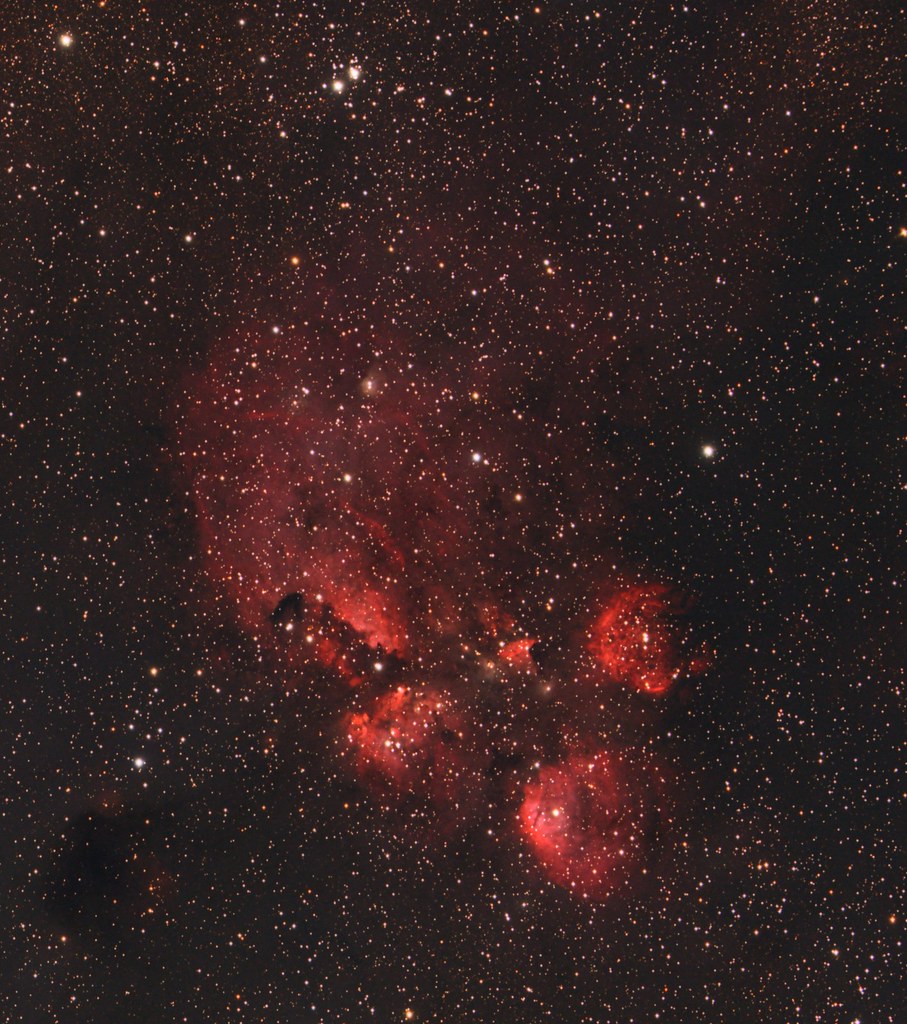
Both nebulas are emission nebulas, both ‘should look red’, yet both look very different compared to each other!
So what we can take away from this is that we can use what we ‘know to be a true color representation’ as one of the ways to judge color representation. But we never should follow this blindly to achieve proper colors. The most important thing is that we should be able to explain the color based on the science that is going on.
Ways to calibrate color in astrophotography
Now we have a definition of correct color calibration, it’s time to actually look at some of the methods to achieve that. I’m sure there will be some methods I’m not covering here, don’t hesitate to let me know in the comments! For now I will discuss the pros and cons of four methods you’ll most commonly see mentioned in discussions on color balance:
- Histogram alignment
- Custom White Balance
- eXcalibrator G2V
- PixInsight’s ColorCalibration
Color calibration should be done in the linear stage
Before we dive into the details of each method, it’s important to understand at which stage of the processing workflow we do the color calibration. This should always be done in the linear stage and won’t render good results in general if the data is no longer linear.
Histogram adjustment
A lot of people will simply adjust the color channels of the histogram in such a way that they align the channels. What aligning actually means can actually be different. Most common is the idea to align the peaks of the histogram. Some people will state you have to align the right side of the curve.
This method is actually quite tricky and I’d even say risky. It can be so effective while beeing so simple that it is easy to get lazy and use it for actual color calibration after or while stretching. But remember, we want to do color calibration in the linear stage of the image. My advice is to use this only as a check of the actual color calibration method you used and perhaps to do some final tweaking to get it exactly to your liking.
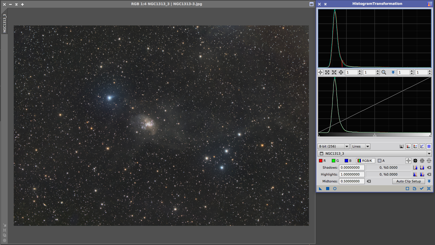
As for the method of aligning the peaks; this will work as long as most of the light in the image combined is neutral.
Let’s say you have a galaxy, then this can work very well since the combined light of the galaxy and stars can be expected to be neutral and the background should be neutral as well.
This is shown in the below image of NGC1313
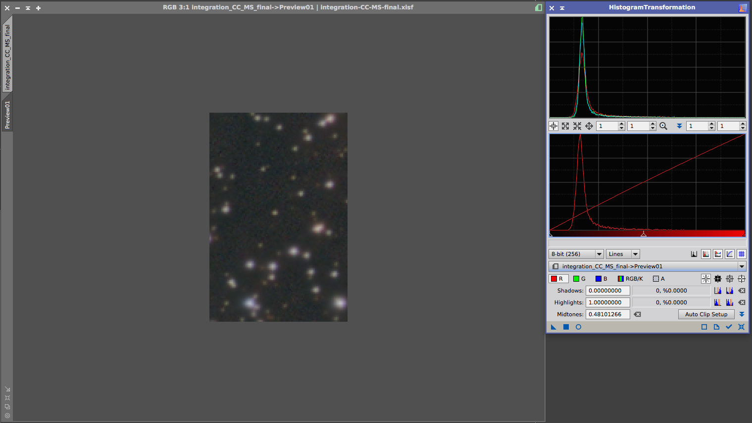
But what happens if we have emission nebula covering most of the field of view? Let’s look at my image of the Prawn nebula. An emission nebula so it is quite red.
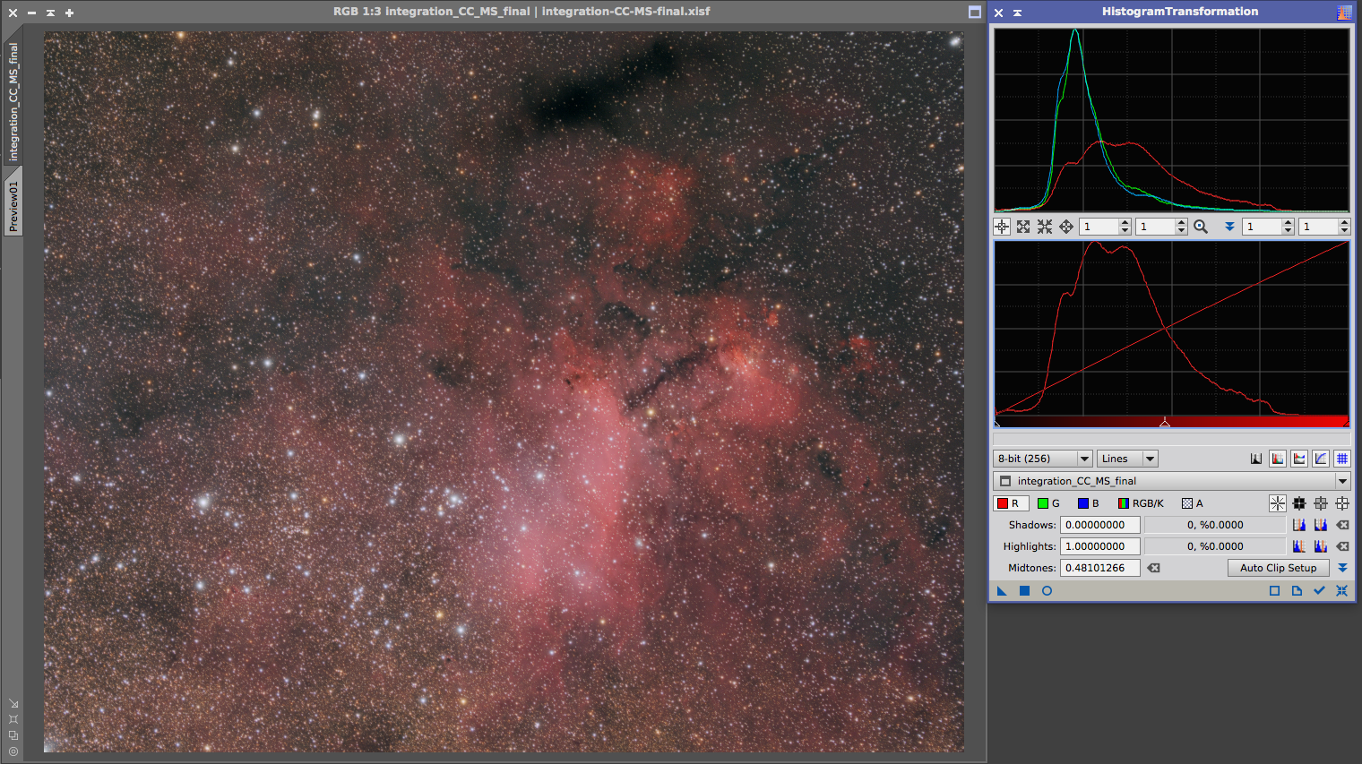
You can see the peaks are not aligned, nor is the right side. However, the left side is and this is important. Because when we look at a small part of the background that doesn’t seem to have h-alpha in it, we can see that the peaks actually are aligned and the background is neutral.
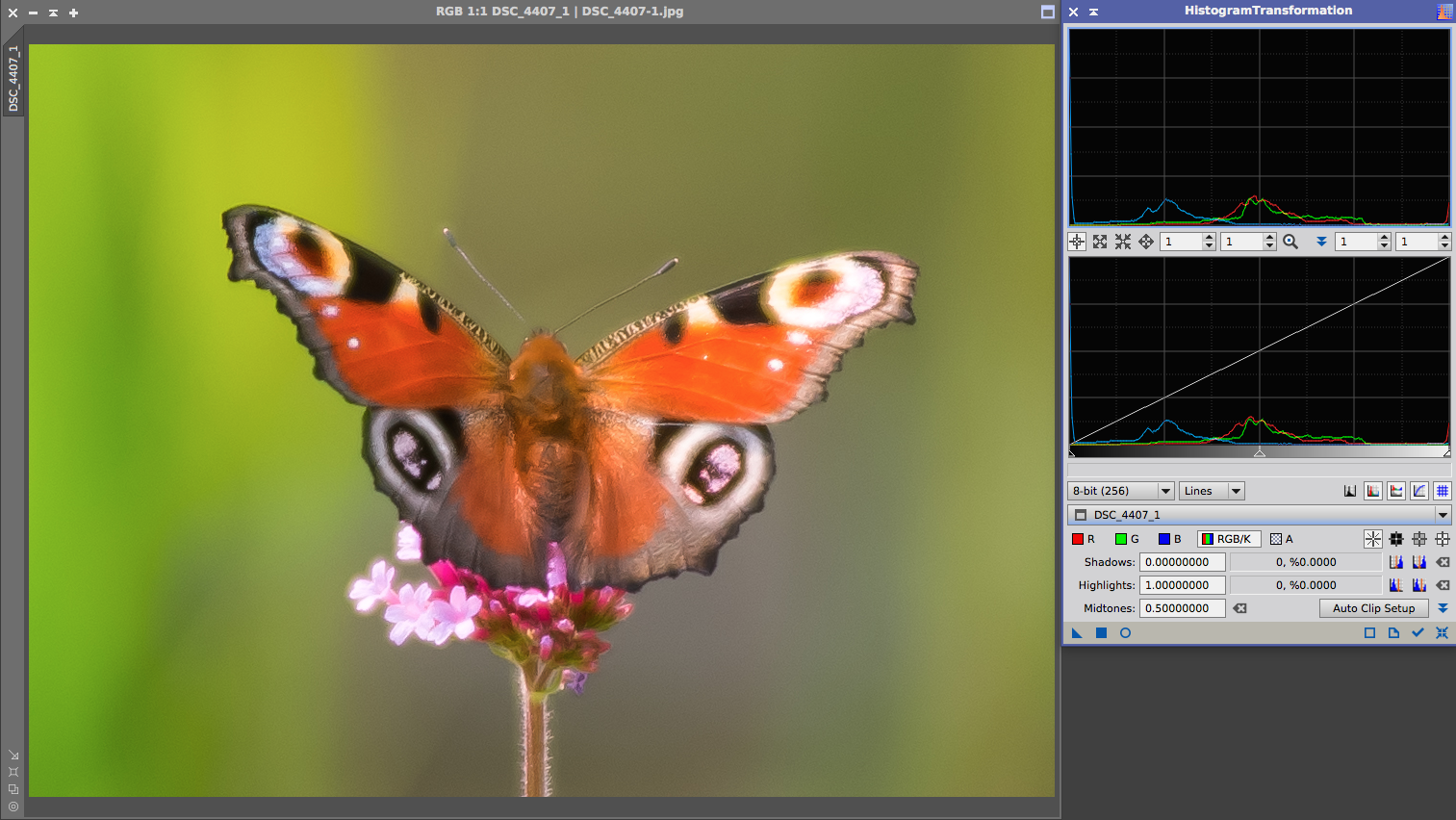
Another example to show that the channels don’t necessarily have to align is this daytime photo of a butterfly. Clearly this is not neutral, as we can see in the histogram.
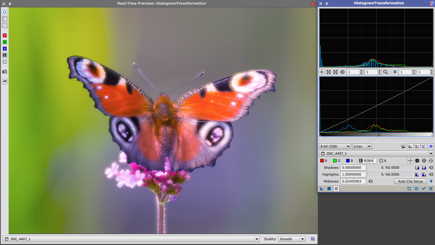
If I would try to align the channels, I’ll get a result like the one shown below. This is clearly not what we want.
So the histogram can be a very useful tool to help us with judging and altering the color calibration, as long as we always pay attention to the context of the image and not blindly align the histogram channels. Checking the histogram on parts of your image can help you greatly to have a detailed check on the color balance.
But remember, don’t use it while or after stretching as your main method for color calibration!
Custom White Balance
Custom White Balance aims to calibrate deep sky images on the white reference we have as humans; our sun. In particular, our sun on a clear day at noon. It is assumed calibrating the custom WhiteBalance to this will give accurate colors in our astrophotos. However, there are a few problems with this method. First of all I don’t think this a inherently consistent idea. On the one hand it aims to calibrate on what us humans perceive to be white while on the other hand neglecting the fact that us humans use chromatic adaptation to shift the colors what we expect to be white. Certain things will look white in the sun on a clear day at noon, still look white in the shade and still look white in artificial lights indoors. So to choose the ‘sun at noon at a clear day’ as the good representation seems very arbitrary to me while speaking about deep sky images since nothing purely reflects light from a star like our sun in those images. Note that it is applicable for imaging the planets, since they actually reflect the light of our sun.
Secondly it has quite some technical issues and it is very error prone to apply the custom white balance to your images in your workflow. You have to avoid at all cost that white balance is applied during calibration because flats will actually introduce noise and/or hurt your signal.
The biggest issue is that it will shift color balance while going from RAW data to the XYZ neutral color space to the sRGB colorspace, while throwing away some of the right side of your histogram, potentially bloating or even clipping stars.
Furthermore, if you have a modified dslr the transition from RAW data to the XYZ neutral color space won’t be accurate.
Custom white balance might give some people good results (in some cases), but I would advice everyone to not use it.
eXcalibrator G2V
eXcalibrator follows the anthropocentric view that our sun, a G2V star, is white and therefor all G2V stars in deep sky images should be white as well. eXcalibrator uses a color database from sky surveys and it will check for stars in your image that should be white and calibrates colors accordingly.
I think this is a consistent philosophy that should give colors one could argue to be correct.
However, taking the difference between the spectral sensitivity of our eyes and the bayer mask in our camera’s, this can lead to colors that seem unnatural to us. In particular; green stars which is even incorrect as there are no true green stars.
PixInsight’s ColorCalibration
The ColorCalibration process from PixInsight is what they call ‘spectral type neutral’. The people from PixInsight argue that taking a G2V star as white reference is applicable to solar system photography, since all planets reflect light from our sun, a G2V star. In deep sky photography however, no object, in general, is reflecting light from a G2V star. They state that the G2V calibration approach is too anthropocentric and they came up with a different, more neutral way of calibration color in deep sky images. Their goal is “to represent a deep sky scene in an unbiased way regarding color, where no particular spectral type or color is being favored over others.”
For a more comprehensive post on this matter I can recommend reading their sticky post on the PixInsight forums on this.
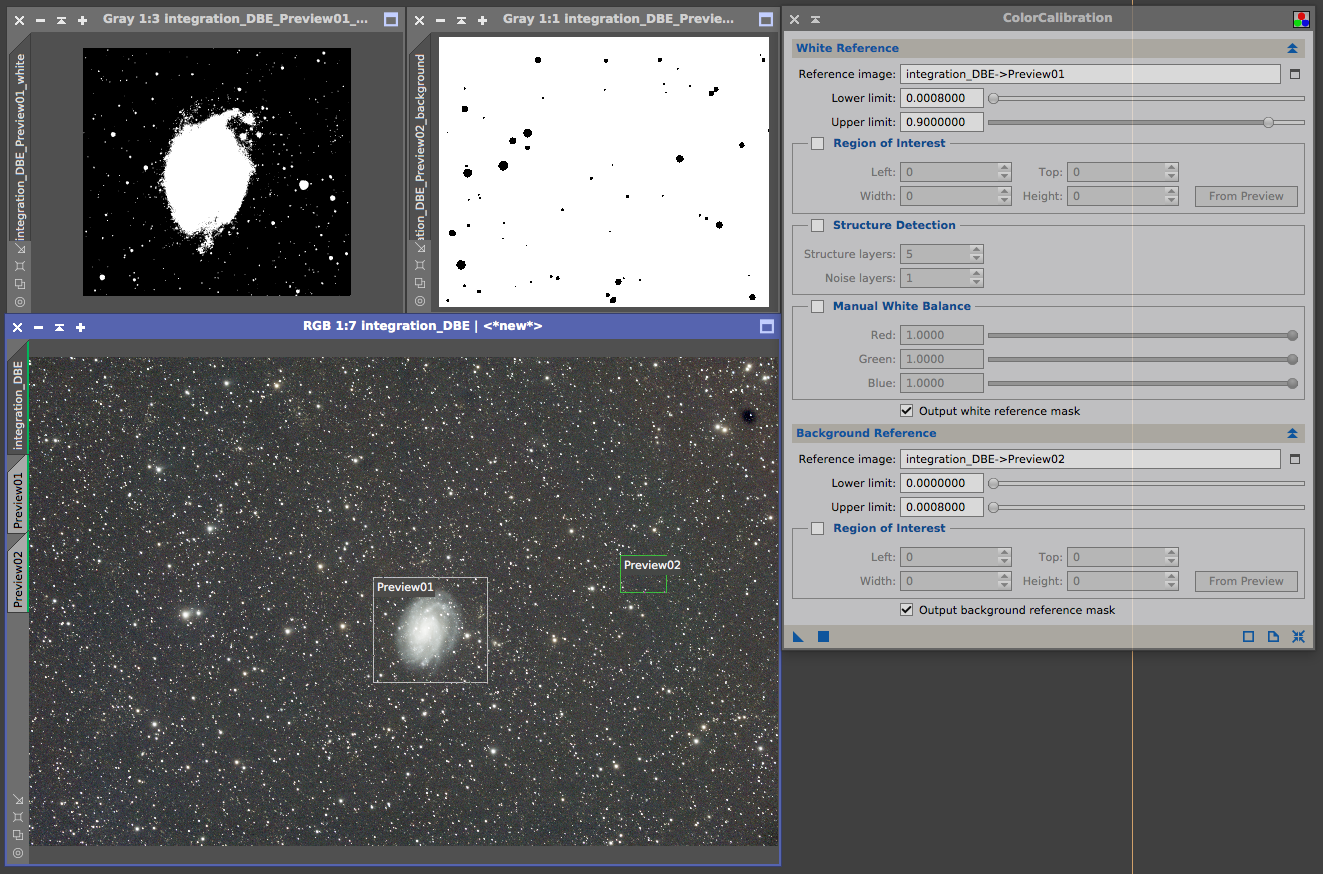
The ColorCalibration works in one of two ways; You can use a galaxy as white reference. This would be a good neutral statement as each pixel in the image of the galaxy would represent numerous stars and deep sky objects of all spectral types and therefor serves as a good white reference.
If there is no galaxy in the image you can use the structure detection mode to sample a large number of stars in the image of different spectral types. This way no specific color is favored and thus this would also be a useful neutral reference.
Furthermore this also complies with the human chromatic adaptation where you can expect the combined light from a lot of stars to be white.
Conclusion on color calibration
There are multiple definitions of what it means to have ‘correct colors’ in your astrophotos. Therefor this always will be a matter of personal preference and everyone will have to figure out what their own vision on the matter is and pick a method of calibrating the colors accordingly.
For me personally the ColorCalibration philosophy and method of PixInsight, combined with a histogram check and (curves) tweak afterwards, has my preference; it gives me consistent, scientific accurateresults with neutral backgrounds while allowing for personal creative freedom in the final tweaking of the hues. All the required elements of good color calibration needed for the right colors in astrophotos.
source:http://dslr-astrophotography.com/right-colors-astrophotos/